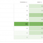
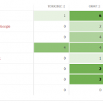
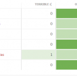
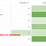
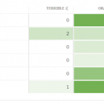
Results are in! A week ago, we started collecting feedback for WordCamp Toronto 2012. Here’s what our attendees had to say about September’s user conference:
Overall Impressions
In a nutshell: George Brown’s wireless situation was the biggest hurdle of our weekend. Luckily the excellent food kept people happy, although the lateness and ill-preparedness of our dining situation left some with a bad taste in their mouth. Our Happiness Bar needs more attention next year, and a steady stream of coffee throughout the weekend trumps fancy espressos.
What can we improve? (Suggestions + Responses)
- The lateness of a couple of things (like the lunch).
- Lunch should have been prepped early: tables could have been ready with the plates, (forks), drinks, etc, even before the food arrived.
- I was disappointed that all of the breakfast and lunch food choices – except for the bean salad – contained wheat. I would have expected at least some fruit and oatmeal for breakfast and some green salads for lunch.
- I kept losing the wireless.
- Flaky wifi connectivity was problematic both for attendees AND presenters who were trying to do things live. Some got flustered when connection errors occurred, and never fully regained composure. And even if they weren’t too stressed it took up valuable time waiting for a re-connect.
- Building Security — was not aware of the Saturday-Sunday event — caused some problems. Audio Problem — sometimes could not hear some speakers.No Coffee — early Saturday morning. No Forks — for Saturday lunch.
- I don’t need to say anything about the lack of wifi esp for a social media conference and lastly .. for the girls out there .. can we get some women’s t-shirts?? Next time in your session can you please put a not applicable option?
- For next time, please provide more water. I noticed in the morning, it ran out within a few minutes.
- I know that the Wi-Fi issue sprung up last minute but George Brown needs to do a better job. I ran off my smartphone hotspot all day – good thing there are plenty of plugs in the rooms!
- T-shirts for women? 🙂
- Forget the hosted coffee table – just get a couple of big coffee containers and set up 2 stations for self-serve!
- Less sugar ridden food (would rather of paid more/less for better food), tea on both days. Some of the speakers seemed dated, ie. 1 discussion to the next had very contrasting ideas “don’t use generic share bars vs. here’s this generic share bar you can use”
- The food for vegetarians is always too limited and why is it stuck on a side table where no one can get to it. Too many people lining up for food when it could have been in two places, food was late and there were no forks at the time of serving.
- Have the food in a cafeteria so people can sit down and mingle. Have the food out and displayed long before the sessions end.
- The happiness bar should be in a room where people can sit down at tables rather than in a hallway on tiny tables where there is no chair to sit down on for the client.
- There were no signs on the rooms again so many people had to keep asking what session was in what room on what floor. Just put a sign on each room or the room # on the brochure. It makes it so much easier for people wandering around the halls.
- There was no coffee on Sunday morning when people arrived. Very disappointing. The doors were locked on Sunday morning. A lineup of people stood outside until after 12:00 noon waiting for someone to open the locked doors.
- Wasn’t impressed with the t-shirt design. Let’s have a contest ahead of time next year to see what some of these designers can really do. I didn’t like last year’s shirts either. Women like light and shapely t-shirts. I think men do too.
- It would be very helpful if you could expand on the title of each session to include a short description of two or 3 sentences about what the session will cover and at what level of knowledge one requires to understand or at least benefit from the presentation. ie. basic, intermediate, advanced.
Session Feedback
In a nutshell: Sessions this year were too high level and we’d benefit from having different session types (e.g. case studies & panel discussions).
Some highlights from the feedback:
- I was really wanting to learn about WordPress in particular and the tools it provides or can work with that are business-specific. (e.g. plugins for doing mailings, keeping a database of clients, all sorts of things).
- Would really like to see a presentation about Testing tools or testing methodology for WordPress.
- Next year I would like to suggest another session or a room that is setup over the weekend with projector and screen for anyone to come in a give a 5-10 min overview of a website they have created using WordPress.
- I like the way Saturday was split into three streams, maybe in the future it can be broken out even further as novice/intermediate/advanced users…or techniques. You get the picture.
- Overall, some of the speakers were great but others just haven’t got the experience of speaking to a group of people and there always seems to be problems with technology at this venue.
- Some presentations were poor. Basically the speakers just provided a list of links that contained info on the subject.
- Enjoyed last minute substitute Developing Digital Marketing In To WordPress with Austin Gunter. Some great takeaways from it, and great presenter, too.
- Richard Martin’s presentation was excellent with lots of insights for people wanting run an online business using WordPress I know it wasn’t specifically about WordPress but his information was very valuable.
- Andy McIlwain’s talk was a little dry and we all expected real samples and tips of how to implement SEO and analytics, not just a list of links for us to look up after. Would prefer to see at least one example of an SEO plugin, and how to fill out the fields properly.
- I’d love to see something contrasting WP and other web development platforms, or talking about using more than one of them and choosing when to use each.
- For those newbies coming in with just a WordPress.com account, it would be great if in the beginner sessions speakers were careful to note sections of their talk that won’t apply to those users.
- Consider organizing ” round tables” for topics which are divisive. Could make the session livelier and you may invite more than one subject matter expert.It may be ok to have popular sessions like child themes run longer because of the numerous questions that crop up.
- Please put signs up so we know which sessions are in which rooms. We kept on having to guess on the 3rd floor!
- Meatier presentations. Don’t tell me about Plugins then say you haven’t tried them. Don’t just give me links. I want to leave with better understanding or deeper knowledge of the topic.
- The lapel microphones didn’t work very well. I found it hard to hear speakers in the main hall and they were continually popping or losing their volume, it was rather distracting.
- On the Sunday, last year the sessions were longer and more practical. I would prefer a workshop style on the Sunday over more 45-minute talks.The Happiness Bar needs to be developed. It’s a great idea, but it was out of the way and crowded (no space).
Thank you to everyone who submitted feedback! We’ll be going over all your comments in more detail to make next year’s event even better.


